
September 8, 2017 | Robert Campbell
Mobile Optimization: Responsive Design and Google Mobile
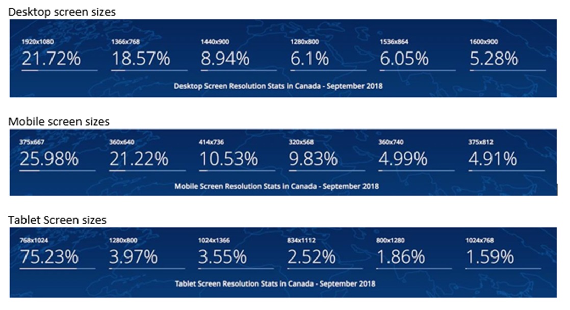
By the end of 2016, people spend more time on their phones every day than their laptops in the US. And over 80% of all Internet users own a smartphone. These numbers have been increasing in leaps and bounds over the last few years and they’re just going to keep increasing. So there really isn’t any good argument to not optimize for mobile devices.
Responsive Design
“Responsive Design” is, in our opinion, one of the most important features of any website. Being responsive doesn’t just refer to your customer service team. It means making sure your website looks amazing on every phone and tablet out there. It also means that Google Mobile will rank you higher than other non-mobile-friendly websites.
Google Mobile
While SEO is still relevant and important as a part of every digital strategy, Google mobile is a new and important consideration.
A few stats to prove our point.
- 75% of users never scroll past the first page of Google.
- 84% of people on laptops click on the first 4 organic search results and that number goes up to 92% for people searching on their mobile phones.
Google has also pointed out that more searches take place on mobile devices in 10 countries, including the US, than on computers. In the US, 2015 data shows that 51% of total digital time is spent on mobile devices versus 42% on desktops.
Do we need to say anymore? We may not need to … but we will.
Is Google Mobile Different from Regular Google?
 Yes … yes it is.
If you type a search term into Google on your computer and then type that same term into Google on your phone, you will notice that the results coming up are probably different – they may even be completely different. The reason for this is because Google Mobile ranks mobile friendly and fast-loading sites higher than sites that are not abiding by Google’s 25 principles for mobile.
What you can do?
Check your company’s website on any and all mobile devices you can get your hands on, including multiple different iOS and Android phones and tablets. And look for the following
- Are there big open spaces between images and copy?
- Are the images loading properly?
- Does the navigation make sense?
- What do the calls-to-action look like?
Also, be sure to check your website on Google’s free tool, which analyzes a url and report if the page has any mobile issues, which will affect its rankings.
www.google.com/webmasters/tools/mobile-friendly
If what you’re seeing and the report show that your site is not mobile friendly, contact the agency that built your site or another digital agency that specializes in Responsive Design.
Depending on how your website was built, you may need minor development work to fix this or major redesign and development.
7 Common Mistakes
Google has published a list of common mistakes that should be avoided.
1) Blocking access to JavaScript, CSS and image files – Googlebot has to have an access to those files so that it can “see” the site like an average user.
2) Unplayable content – videos or content has to be playable on mobile devices – the era of flash video players is gone, and companies should make sure that all videos can be accessed from any device.
3) Faulty redirects – if a company has a separate mobile site, it must redirect mobile users to the appropriate and corresponding desktop URL and not e.g. to the homepage.
4) 404 page not found on mobile device – some sites serve content to desktop users, but show an error page (404) to mobile users.
5) Avoid overlays that partially or completely cover the contents of the page the user is visiting, like: website’s native app, mailing list, sign-up forms, advertisements.
6) Irrelevant cross-links.
7) Slow mobile pages – it is important that page loads fast on mobile devices, especially when visitors have limited connection to the network, since they will become very frustrated and decide to leave your website.
Google’s 25 Principles for Mobile
Homepage & Site Navigation
1) Keep calls-to-action front and center – participants of the Google’s test, had the easiest time completing tasks on sites that clearly displayed primary calls-to-action in the main part of the site.
2) Keep menus short and sweet – a shorter menu with separate categories is easier for mobile visitors to navigate.
3) Make it easy to get back to the homepage – visitors usually expected tapping the logo at the top of a page to take them back to the homepage, and became frustrated if it doesn’t work.
4) Don’t let promotions steal the show – visitors get distracted by a large promotional banners, which makes it hard for them to learn more about the company’s offerings.
Site Search
5) Make site search visible – visitors who are looking for specific information usually turn to search – so search should be one of the first things mobile users see on site.
6) Ensure site search results are relevant – visitors don’t bother to swipe through multiple pages of search results. Instead, they judged a site’s search based on the results it returned first – make sure your first page of search results are the strongest.
7) Implement filters to improve site search usability – participants of the Google’s test, relied on filters to narrow down search results, and actually abandoned sites that couldn’t reduce volume.
8) Guide users to better site search results – it can be helpful to ask users a few questions before they search to ensure they get results from the most relevant content segment.
Commerce & Conversions
9) Let users explore before they commit – in the study, participants became frustrated by sites that demanded registration in order to continue
10) Let users purchase as a guest – visitors can feel annoyed at a site that require registration to purchase.
11) Use existing information to maximize convenience – for registered users, it’s worth to pre-fill their preferences.
12) Use click-to-call buttons for complex tasks – participants of the Google’s test, appreciated the option to call a company to complete an action over the phone, rather than fill out complicated forms on their mobile device.
13) Make it easy to finish a conversation on another device – offer an easy way to save or share information across devices to keep users in your funnel – not all were comfortable buying on mobile devices.
Form Entry
14) Streamline information entry – offer users a number pad for fields requiring number entry.
15) Choose the simplest input method for each task – consider if a toggle or dropdown menu is the optimal choice for each entry on your mobile forms easy for users to tap.
16) Provide a visual calendar when selecting dates – visitors not always remember the exact dates for “next weekend” when booking a flight, and you don’t want them having to check a calendar app.
17) Minimize form errors with labeling and real-time validation – label your forms clearly, and make sure the labels are visible when users are actually entering information.
18) Design efficient forms – minimize the number of fields in your forms, and autofill information wherever possible.
Usability & Form Factor
19) Optimize your entire site for mobile – your site is easiest to use if all your pages are designed for mobile use.
20) Don’t make users pinch-to-zoom – visitors can miss calls-to-action if they have to zoom on a site.
21) Make product images expandable – include high-quality images of products so visitors can get a better look at details.
22) Tell users, which screen orientation works best – Study participants tended to stay in the same screen orientation until something prompted them to switch.
23) Keep your user in a single browser window – switching between windows on a smartphone can be troublesome, and raises the risk that visitors might not find their way back to the site.
24) Avoid “full site” labeling – users might assume that the mobile site is condensed, use labels like “desktop version” instead of “full”.
25) Be clear why you need a user’s location – always make it clear why you need a user’s location, and how the information will influence their experience.
Responsive … Mobile … Priority … Google
OK – those may seem like random words put together in no particular order, but I think this post has shown pretty clearly that they do go together – although the order is definitely random.
At least, Google thinks so. And you ignore Google at your own peril.
Responsive design is now a necessity – people are spending more time on their phones than their computers. And mobile-friendliness affects your rankings on Google mobile, which, as we just said, is itself out-pacing Google searches on computers.
There can be no doubt that investing in Responsive Design is the best way to meet your short and long-term business goals.